March 10, 2022
Dynamism, Domesticated | Susan Tallman
The New York Review
The effervescent linocuts of Sybil Andrews and Cyril Power from the interwar years transformed the Futurist fascination with speed, rendering common pleasures in a way that would not be seen again until Pop Art.
“A decent home, a temperate climate, and a moderate nation. It has its disadvantages in art,” Nikolaus Pevsner observed in 1955. The moderate nation was England, the German-born Pevsner’s adopted home, a place that had fostered
no Michelangelo, no Titian, no Rembrandt, no Dürer or Grünewald. There are no vast compositions in the churches, and only bad if vast compositions in the palaces, but there are exquisite water-colours and miniatures, things on a small scale…. England also produces a nice crop of amateur painters from maiden aunts to Prime Ministers.
It is a snarky comment, but not without admiration or, for that matter, a measure of truth.
Jenny Uglow has brilliantly illuminated just this sort of Englishness in biographies of Edward Lear, Thomas Bewick, and William Hogarth—masters of the exquisite watercolor, the miniature, and things framing human folly on a small scale, in that order. Her new book, Sybil and Cyril: Cutting Through Time, moves into the twentieth century, when Picasso reigned as the master of pictorial disruption in France and Dada was sowing wild oats all over the Continent. Britain had great modern artists as well—Henry Moore for a start—but Pevsner was not wrong in predicting that England would not rank among the “principal contributors” to painting in the first half of the twentieth century: “The reason is not far to seek…. Art in her leaders is violent today, it breaks up more than it yet re-assembles. England dislikes violence.”
There had been a moment, before the Great War, when Italian Futurism and English jingoism teamed up in the movement of Vorticism, with its push toward abstraction and its call for “Civil War among peaceful apes.” In the face of actual carnage, however, once-radical artists like C.R.W. Nevinson and Edward Wadsworth turned back to the depiction of the observable world, while others took the Futurist fascination with speed and dynamism and domesticated it.
Sybil Andrews and Cyril Power are known (to those who know them at all) for buoyant and brisk pictures of Tube trains, sporting events, and kaleidoscopic crowds, all made using a humble medium—the linoleum cut—borrowed from children’s classrooms. Sybil and Cyril arrives subsequent to the Metropolitan Museum’s superb recent exhibition “Modern Times: British Prints, 1913–1939,” in which Andrews and Power took a star turn as part of the Grosvenor School of linocut.
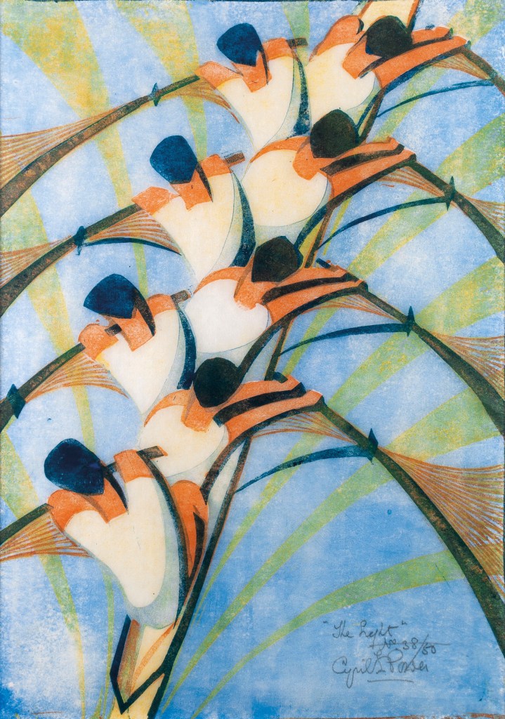
Everything in these prints is in motion: carnival rides swing elliptically into the air, horses unfurl their legs like ribbons, cars swell and surge. In Power’s Lifts (1930), cherry-red elevator cars hurtle into the air, unconstrained by pulleys or pistons. In Andrews’s Speedway (1934), motorcycles bear down ferociously. In Lill Tschudi’s Tour de Suisse (1935), bicyclists bank on a careening road. The prints seem lit from within. In her catalog essay, the conservator Rachel Mustalish dismantles The Eight (1930)—Power’s picture of rowers bent in unison like parts of a pinnate leaf—to show how this effect was accomplished. Gillian Forrester and the show’s curator, Jennifer Farrell, provide background about the political and economic crises amid which the artists were working, but such troubles are all but invisible in the prints themselves. They effervesce with common pleasures in a way that would not be seen again until Pop Art.
The Eight,along with Bringing in the Boat (1933),Andrews’s image of oarsmen lifting their scull from the water, was the prompt for Uglow’s book: “I have known them all my life—in my father’s study, then my mother’s hall, blasted by sunshine, and finally on the stairs in my own home.” Her father had rowed at Oxford, and the prints were a wedding gift: “I walked past them without a thought for years, hardly even reading the signatures.” She was not alone. After a flurry of popularity in the Thirties, when linocut exhibitions crisscrossed the globe, the prints all but disappeared from public view. In the light of coming war and its aftermath, they came to seem cute but insubstantial, the kinds of things, a friend once told me, you hang in the kitchen.
How this art came to be, and how it came to be forgotten, is one part of the story Uglow tells. The other part concerns a relationship that stubbornly refuses discovery. Andrews and Power met in 1920, when she was a twenty-two-year-old schoolteacher with artistic aspirations and he was pushing fifty, a not overly successful architect who had written the three-volume History of English Medieval Architecture,illustrated with his own assiduous drawings. After working through the war at an airfield in Kent, he had rejoined his wife and four children in her hometown of Bury St. Edmunds.
Andrews had also grown up in Bury (the two families were loosely related) and had returned there from Bristol, where she had worked as a welder, building planes for the military. She was not a femme fatale (“all very plain,” a woman who knew the family described them, “and all eccentric”), but Uglow paints her as a force of nature, with “her floppy fringe and flashing blue-green eyes, her rapid walk and her fierce immersion in her art.” She and Power bonded over plein air sketching of local views. His infatuation, Uglow suggests, was “a post-war crisis as much as a mid-life crisis,” a sudden need to live life to the fullest in a precarious universe. In any case, when she moved to London to enroll in art school, he followed.
For the next twenty years Andrews and Power would spend most of their time together, though he kept separate rooms. Her family seems to have accepted the situation with no fuss, and his to endure it with almost baffling equanimity. Neither Power nor Andrews seems to have spared his wife and children much thought, and Uglow notes his cavalier willingness to move them around “like chess pieces.” For financial reasons his son Toby had had to forgo Cambridge when his father left; then, having settled into an amenable situation in a bank, he found himself suddenly transferred—“a result of a request from my father to the bank”—and told to rent a house and look after his mother, sister, and two brothers. While Toby noted his father’s “failure to be an adequate Provider, and his somewhat ‘Gauguinesque’ behaviour,” neither he nor his mother forced a permanent rupture.
Friends treated Andrews and Power as a couple, but the exact terms of that coupledom remain elusive, since their mutual correspondence has not survived. Power was a convert to Catholicism, which would have complicated any idea of divorce—but were they even that kind of couple? Andrews’s father had decamped permanently to Canada when she was a child, so perhaps Power—twenty-six years older, knowledgeable, and encouraging—filled a father-shaped void. In the absence of any intimate account of their emotional, never mind physical, interaction, it’s all guesswork. And Uglow is too principled a biographer to force an interpretation.
Instead she traces the surface activity of their lives through appointment diaries and scrapbooks: there was theater (lots of Shakespeare), music, lectures, exhibitions, and a surprising amount of jam making. (“Very hot. 12 lbs Morello [sour cherries]…prints of Tennis,” reads a typical diary entry from July 1933.) Power picked up occasional architectural work and checked in on his family every couple of months. In the meantime he and Andrews drew together, painted together, “printed each other’s work, used each other’s sketchbooks.” On the beautifully designed cover of the UK edition of Sybil and Cyril, leaping horses from one of her prints meld seamlessly with an escalator from one of his.
To earn money, they began making etchings in the precise yet atmospheric manner popularized by Whistler in the 1850s and still a marketable staple of middle-class interiors in the 1920s. Traveling in Britain and sometimes abroad, they sought out ancient buildings and modern wharfs or bridges that would render rewarding plays of smudgy shadow and overexposed whites.
But their interest in art was eclectic: they admired Van Gogh, Cézanne, and Han Dynasty reliefs; they bought African fabrics and a carved door from Nigeria, and sketched “stitching techniques and patterns from Turkey, Syria, Palestine, Mesopotamia.” The jejune manifesto they wrote in 1924 lauds “the titanic, savage, satanic strength” of industry, but also “the Eternal Spiritual Reality behind material things that no camera can give.” While their plea for art as a spiritual and reforming force echoes Ruskin, their assertion that “the Primitive is always Modern and Eternal” was entirely of its moment.
When their friend Iain MacNab founded the Grosvenor School of Modern Art with anti-academic ideas about self-discovery and expression, Andrews came on board as school secretary and Power agreed to teach architectural history. Together they signed up for the weekly class in linoleum block printing taught by Claude Flight.
Flight was something of a legend, a former engineer and beekeeper who had turned to art and spent his summers in a cave. (“A very attractive cave apparently,” wrote the artist Dorrit Black, “but still a cave.”) He had sympathized with Futurism’s industrial vigor, though not its bellicosity. Artists should, he felt, respond to the “hustle” and “restlessness” of modern life, but he evoked these qualities in compositions that were fluid and resolved rather than jangly and anxious. The sinuous line of his double-decker buses in Speed (1922) is closer to Art Nouveau than Vorticism.
For Flight, linoleum was not just a medium but a mission. Inexpensive and industrial, it had the potential to bring artists “nearer to the spirit of their age” and to democratize the making of art. (For gouging the surface, he recommended an umbrella rib.) Producing prints that were modest in size (for the average home) and cost (for the average buyer), lino would, he believed, finally bring modern art to the masses. He was wrong about the economics—the method was too time-intensive to be both affordable for workers and remunerative for artists. He was right, however, that linoleum’s material properties could galvanize visual invention.
In the vast interior of Queen’s Hall (later destroyed in the Blitz) Andrews recalled “the whole place crammed with people—tremendous swirling patterns, with rows of lights, a huge storey swirling up to the next.” It was an inspiration and also a frustration: “I’d been trying to get it in paint and couldn’t. And then along came linocuts.” The process had no room for incidental particularity, so she stripped the building of its painted cherubs, gilt ornament, and fountain of goldfish. In Concert Hall (1929), the big balconies turn like cogs looming over an orderly swarm of silhouetted heads—the thrill of the crowd and the hush of anticipation hang suspended in blue shadow and yellow light.
For Power also, Uglow writes, Flight’s teaching brought out “technical daring that one would never have expected from his watercolours a few years before.” Nor indeed from either artist’s work in other media, earlier or later: their drypoints continued to recall the nineteenth century; the oil paintings and monotypes reproduced in Uglow’s book are competent but unremarkable.
Shown in the “First Exhibition of British Lino-cuts” at the Redfern Gallery in London, Straphangers (1929), Andrews’s rondel of geometric heads and hats, was hailed as“the very soul of modern London.” Of Power’s Tube Staircase (1929), in which the daunting spiral at the Russell Square station curls in on itself like a living thing, the Sunday Times wrote, “It is extremely decorative, and at the same time an illuminating and intimate study of the beauty to be found in an aspect of hyper-modernity.”
“Decorative” was not yet a term of condescension, not yet the foil of highbrow modernism. In Britain, William Morris’s ideal of integrating art and everyday life still held sway: Bloomsbury artists had made lyrical, painterly housewares at the Omega Workshops, while Vorticists at the Rebel Art Centre did so in an edgier, more aggressive mode. Flight and Edith Lawrence ran a design business that applied their art to “everything from murals to pyjamas,” Uglow notes. The first gallery to show Picasso and Matisse in London was located in Heal’s furniture store. Uglow cites a 1926 article in Colour magazine casting the distinction between fine and applied art as mollycoddling: “This metaphysical business can be overdone. Art is made of sterner stuff, of more substantial matter. It can and does exist in lower regions, where common mortals dwell and earn their living.”
Under the visionary direction of Frank Pick, the Tube had become the nation’s most accessible venue for new art: Edward McKnight Kauffer produced posters of such remarkable typographic and pictorial invention as to beggar the distinction between “art” and “design.” Pick commissioned Man Ray and László Moholy-Nagy, as well as the composite persona of “Andrew Power” (though Andrews claimed that Power’s contribution was limited to securing the commissions)….