


August 27 – October 1, 2026
Richard Tuttle and Odili Donald Odita: Language and Pattern
Crown Point Press
In Person Viewing:
657 Howard Street
San Francisco, CA 94105
Richard Tuttle (b. 1941, Rahway, New Jersey) is a sculptor who lives and works in Maine and New Mexico. Tuttle made his first prints, woodcuts, as part of an artist’s book in 1965. Since then, he has created prints and artist’s books continuously throughout his career.
In 2005, in Time magazine, Richard Lacayo called Richard Tuttle “the man of small things.” Lacayo was reviewing Tuttle’s retrospective at the San Francisco Museum of Modern Art, which, he said, “sends you home with your senses briskly reconditioned.” Tuttle, he added, “has been increasingly recognized as a genuine, if highly idiosyncratic, American master.”
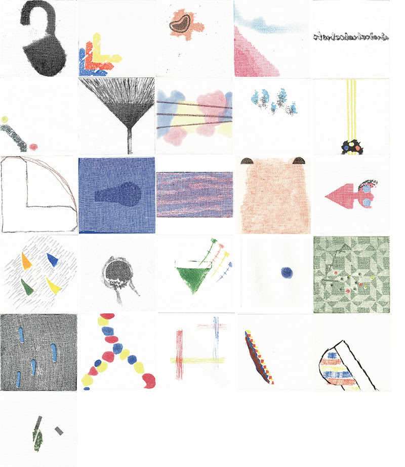
Crown Point Press published Tuttle’s print Transasian in 1993. Over the following twelve years, he created ten print projects, eight of which are presented in portfolios. Crown Point’s founding director, Kathan Brown, wrote this about Type, Tuttle’s portfolio of 26 etchings from 2003: “Why do the images in Richard Tuttle’s new alphabet not resemble the letters of our alphabet as we know them? The first answer that came to me was affected by knowing that Tuttle had already drawn many of the images before it became clear to him that he was making an alphabet. But, in thinking more about it, I realized that even if he had set out at the beginning with an alphabet in mind, it is unlikely that familiar letters would have appeared. It is not in character for Tuttle to redesign or illustrate existing forms. He is in pursuit of new forms. In making an alphabet, he thinks beyond the recognizable letters. ‘One of my discoveries,’ he says, is the ‘correspondence of letters and numbers.’ Tuttle’s concept of an alphabet is essentially one of sequence… Tuttle chose the title of the series, Type, for the word’s association with printing, but also for its meaning as a model characterizing or foreshadowing other similar things.
Tuttle has called the images in this new alphabet ‘playful.’ He made them in the order in which they are named. The artist heard a ‘little fanfare’ in his head when he saw the twelfth image come off the press. ‘You have the lock, and now you have the key!’ he exclaimed. ‘The rest of the alphabet is about using it.’ He sees the first twelve prints as ‘slower, taking time, looking for some-thing,’ and the final twelve as having more intensity… The portfolio box that contains the prints is a larger, elaborate, framing device. ‘Here is a box of images… ‘ you read inside the top cover. ‘Art is beyond nature,’ Richard Tuttle has said. ‘If you can look with eyes that see beyond nature, it is truly dazzling.’ “